
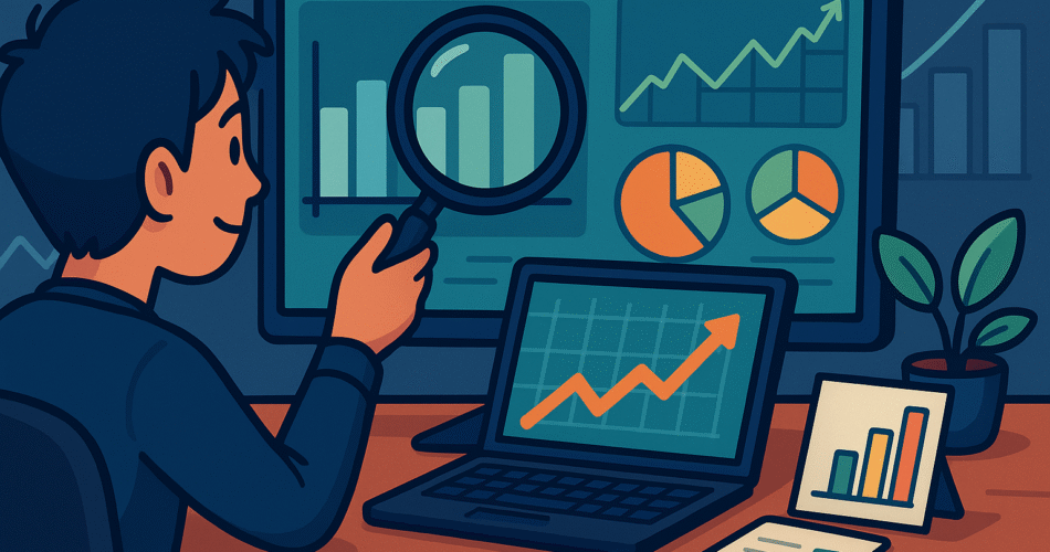
In today’s fast-paced finance world, the difference between a savvy investor and a lost one often comes down to how they interpret data—not just how much. But interpreting raw numbers is easier said than done. That’s where financial data visualization comes in, and why platforms like Peaks2Tails put so much emphasis on teaching this powerful skill.
Why Visualise Financial Data?
- Clarity Through Simplicity
- Complex spreadsheets and raw figures can obscure patterns.
- Visuals like bar charts, scatter plots, histograms, and candlestick charts turn dense data into intuitive images that highlight trends, correlations, and outliers.
- Faster Informed Decisions
- Visual representations help spot emerging trends or risks quickly.
- This enables better judgments—especially under market pressure.
- Improved Communication
- Good visualisations tell stories: they answer the “what”, “why”, and “how” behind the numbers.
- Whether presenting to management, clients, or team members, visuals help your audience grasp insights fast.
Key Chart Types for Financial Data (Emphasized in Peaks2Tails’ Courses)
According to their “Deep Quant Finance” program, Peaks2Tails incorporates advanced visualization techniques using tools like Matplotlib, Seaborn, Cufflinks—and even financial‑specific plots such as candlesticks and Bollinger Bands. Here’s an overview:
| Chart Type | Use Case |
|---|---|
| Line / Area Charts | Show long-term price, profit, or interest trends |
| Scatter Plots | Examine relationship—e.g., risk vs. return |
| Bar / Column Charts | Compare discrete financial categories (e.g., sector earnings) |
| Histograms | Reveal distribution of returns, volatilities |
| Candlestick Charts | Essential for trading—showing open, high, low, close data |
| Bollinger Bands | Highlight volatility and price deviations |
How Peaks2Tails Teaches You to See the Data
1. Hands-On Visualization Labs
In both Excel and Python labs, students actively build and interpret visuals. Peaks2Tails’ methodology follows a full-cycle learning process: from data selection → cleaning → modeling → visualization.
2. Excel Animations & Python Code
Visual learning is supercharged by dynamic Excel animations and reproducible Python scripts — ensuring you not only see but also understand how every chart element is constructed .
3. Domain-Specific Examples
Whether it’s candlesticks for trading or volatility bands for risk, visuals are tailored to contexts like derivatives, credit risk, and portfolio analytics.
Best Practices for Effective Financial Visualisation
- Choose the Right Chart Type
Match the chart to your data question: distributions need histograms, relationships need scatter plots, trends need line graphs, and market data needs candlesticks. - Keep It Readable
Use clear axis labels, legends, consistent scales, and avoid unnecessary chart ornamentation. - Add Context Matters
Include reference lines (e.g., mean, benchmarks), shaded risk zones, or overlays like Bollinger Bands to add insight. - Interactive Visuals = Deeper Insight
Techniques taught at Peaks2Tails with Python libraries like Cufflinks facilitate zooming, tooltips, and filtering—making it easy to explore data layers without re‑plotting. - Tell Your Story
Visuals are powerful storytelling tools—annotate key events (like earnings dates), explain spikes/dips, and structure visuals in reports to guide the viewer’s understanding.
Bringing It All Together: A Practical Scenario
Imagine you’re analyzing a stock portfolio. You could:
- Line Graph tracking the portfolio’s total value over the past year.
- Histogram of monthly returns to assess volatility.
- Scatter Plot of individual asset returns vs. their risk metrics.
- Candlestick Chart of a volatile stock, with Bollinger Bands, to monitor price action.
The result? A multi-angle visual story that boosts insight, reveals anomalies, and guides smarter decisions.
Why Peaks2Tails Is Your Go-To for Mastering Visualization
Peaks2Tails isn’t just another financial‑training brand. As an end‑to‑end learning platform focusing on quantitative and risk modeling, they support every step—from theory to real-world application. Their Deep Quant Finance bootcamp, for example, dedicates entire modules to visualisation using both Excel and Python—including financial‑specific plots like candlesticks and Bollinger Bands.
Whether refining charts in Excel or scripting plots in Python, their hands‑on labs, animations, and coding resources make you fluent in the language of financial visuals. Once you can see the signal in the noise, your decisions become more confident, quick, and evidence‑based.
Final Thought
In financial analysis, raw data may be king—but visualisation makes it understood. Platforms like Peaks2Tails turn complex models and datasets into compelling visuals, empowering you to decode risk, forecast trends, and drive financially sound decisions.
📈 Ready to test your skills? Explore Peaks2Tails today, unlock their data viz techniques, and start making smarter financial choices—with clarity and confidence.